Free Colorado County Data: Poverty, SNAP + Food Access
It is 10:30 on a Tuesday night, a grant application is due Friday, and you need one number: how many households in your county receive SNAP, the Supplemental Nutrition Assistance Program. You know the number exists. You also know it is buried three menus deep in a federal data portal, and that finding it, checking the year, and formatting the citation will eat an hour you do not have.
We built something for that hour.
Today we are launching free data pages for every Colorado county, all 64 of them, plus a statewide index. No login, no paywall, no email gate. Just the local facts, compared, ranked, and cited.
What is on every page
Each county page covers the numbers that show up again and again in needs statements, board decks, and program plans:
- Food Insecurity & Access: the estimated share of residents (and children) who are food insecure, from Feeding America‘s Map the Meal Gap, used with permission
- Poverty and child poverty
- Households receiving SNAP benefits
- Uninsured rate
- Rent burden
- Median household income
Every figure comes with three companions: the Colorado value, the national value, and the county’s rank among all 64. And every figure carries its source and data year, so you can paste it into a grant application without a second trip to verify it.
Why county pages, and not just a state dashboard
Because averages are where the real story goes to hide.
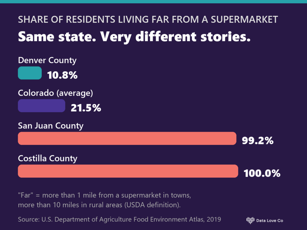
Statewide, 21.5% of Coloradans live far from a supermarket. The national figure is 22.2%. Side by side, those numbers suggest Colorado is ordinary. Then you open the county pages. In Denver County, 10.8% of residents live far from a supermarket. In San Juan County, it is 99.2%. In Costilla County, it is every single resident. (“Far” is the U.S. Department of Agriculture definition: more than 1 mile from a supermarket in towns, more than 10 miles in rural areas.)
A program designed for the average is designed for a county that does not exist. The people doing this work already know their communities are different. Now the numbers that prove it are one click away.
Built for the people who use numbers to help people
We made these pages with a few specific readers in mind:
- Grant writers, who need a cited, current figure for a needs statement, tonight
- Program officers and nonprofit leaders, who need to see how their county compares before deciding where a program goes next
- Public sector staff, who need a shared, sourced starting point for a community conversation
If you are a journalist, a student, or just a curious neighbor, the pages are yours too.
About the data
The figures come from two public sources: the U.S. Census Bureau’s American Community Survey 5-year estimates for 2020 to 2024, and the U.S. Department of Agriculture’s Food Environment Atlas. Small counties can have wide margins of error, and where an estimate should be used carefully, the page says so. We would rather flag a number than let it overstate its own confidence.
Ask the next question
A data page answers the first question. The second question is usually more interesting: how has this changed over time, where inside the county is the need concentrated, what should we do about it?
That is why every county page connects to Dorothy, our AI data analyst, with your county already selected. Ask in plain language, the way you would ask a colleague: “How does food access here compare with the counties around us?” Dorothy answers with cited data.
Start with your county
Find it here: dataloveco.com/data/colorado. We are starting with Colorado, and we would love to hear what data, and which places, would help your work next.
Lead with heart. Build with data.